Dim Sum Bar
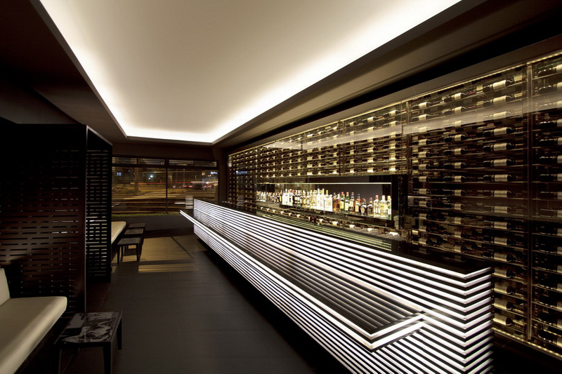
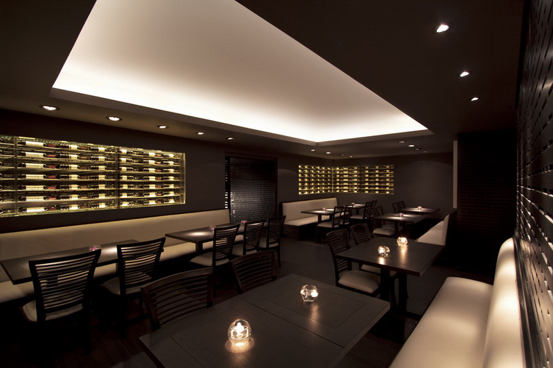
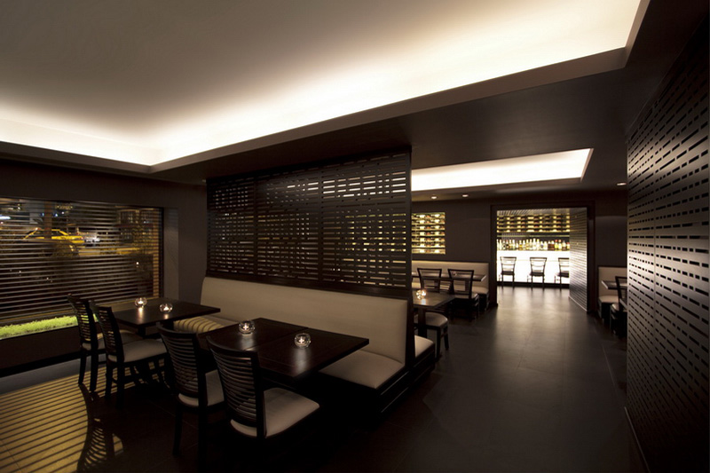
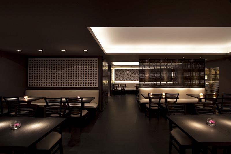
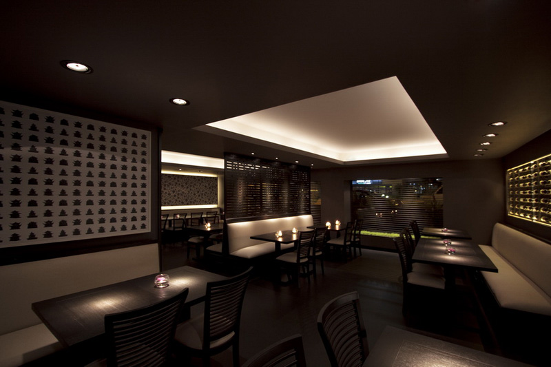
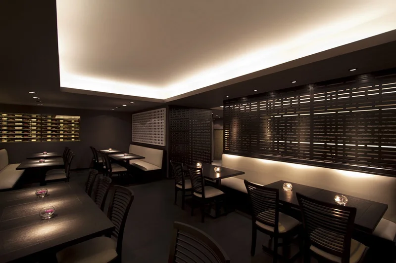
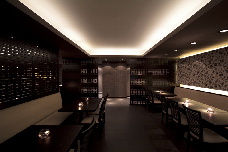
Our objective was to design a restaurant with an elegant and comfortable atmosphere which feels both contemporary and classic. This approach was born out of a close collaboration with the client, and arose from a set of tables and chairs the client had previously purchased for the space. Consisting of white leather cushions set on dark wood frames, the chairs prominently feature a ribbed backrest. The components of the chair provided an aesthetic vocabulary used throughout the project. The result is a harmonious relationship between the client’s furniture and the interior design.
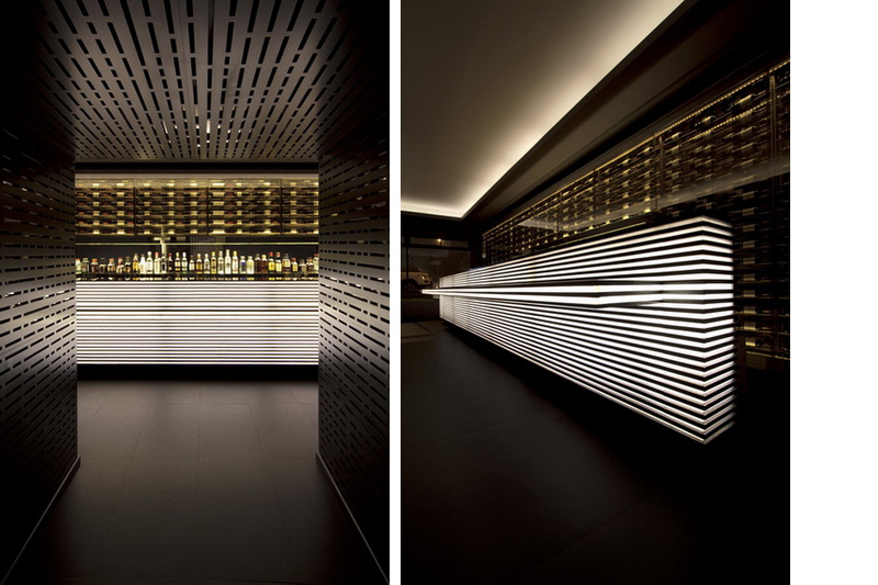
The existing space of the site was highly irregular in both shape and proportion, and a perimeter of load bearing concrete walls limited improvements to the layout. From the beginning, it was clear that the design should be focused on the surfaces and lighting. This led to us to experiment with ideas concerning 2-dimensionality and depth.
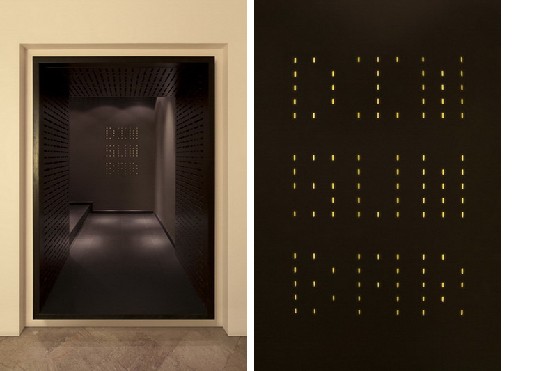
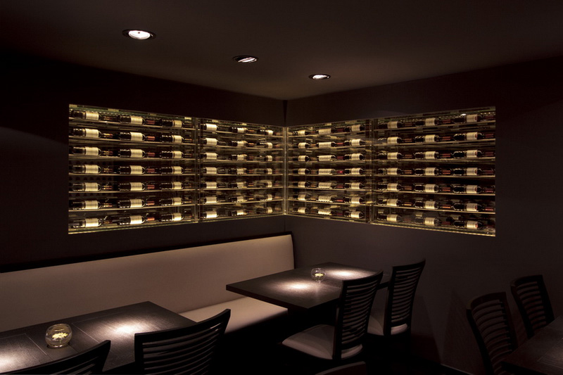
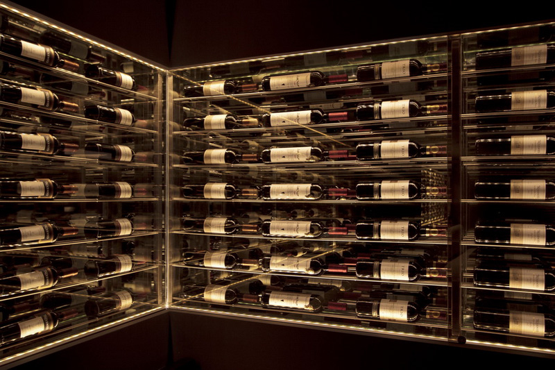
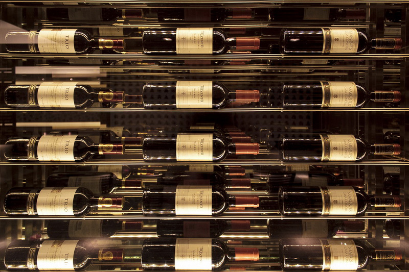
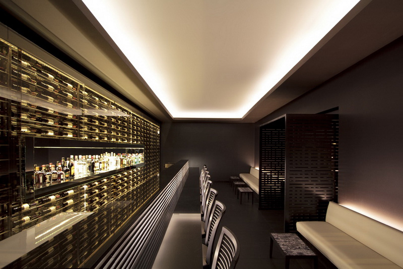
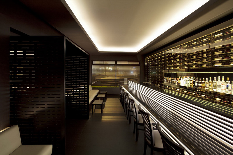
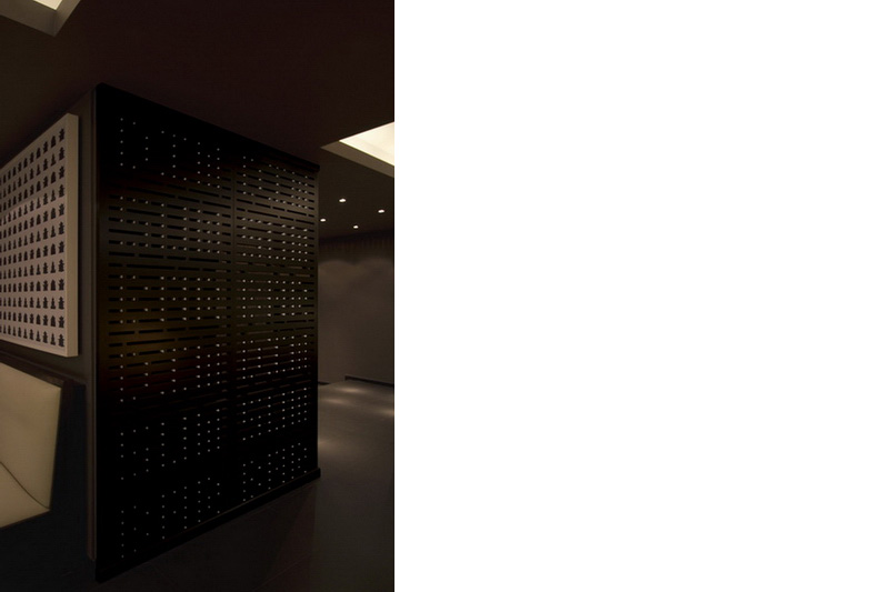
The privacy screens that divide the space, at first glance, look like traditional Chinese doors, but the seemingly random pattern of perforations actually contain a hidden message. The inner linings of the perforations were painted white on one side only. "DIM SUM BAR" is spelled out repeatedly, but only visible from certain angles. The entry signage is composed of holes that have been drilled into the wall that are then back lit. The vitrines that display the wines contain only one layer of bottles, but due to the mirror's reflections, a two dimensional grid appears as an infinite three dimensional matrix.
Dim Sum Bar was completed in 2011.

